The Problem That Sparked It All
Picture this:
- The Problem That Sparked It All
- Introducing: The Reminder widget
- The Product Thinking: Why a Nudge is Better Than a Shout
- Behind the Scenes: The Tech and UX
- UX Thinking: How We Kept It Clean
- Behind the Scenes: Tech + Experimentation
- Backend Engineering
- Frontend Engineering
- Real-World Impact: The Before and After
- Before the Widget:
- After the Widget:
- Building It Together
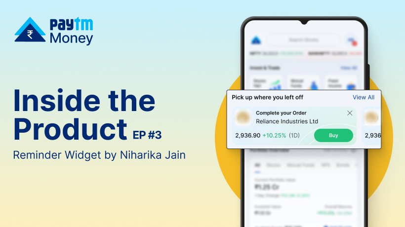
The market is buzzing. You’ve done your research, and you’re about to buy a stock. You’re placing a trade, but just before hitting ‘Buy’, the Wi-Fi stutters or you step into a poor network zone. The app doesn’t confirm the order. You assume it went through—but it didn’t.
These arent hypothetical scenarios; these are a reality we’ve all faced. At Paytm Money, we believe your investment platform shouldn’t penalize you for being human. It should work like a trusted assistant, patiently waiting to help you pick up right where you left off.
This core belief is why we built the Reminder widget—a small but powerful new feature on your homescreen designed to give your crucial actions a second chance.
Introducing: The Reminder widget
This sleek homepage widget is our way of saying: “We’ve got your back.”
It shows up only when relevant—if you:
- Exit mid-way through placing an order
- Experience a failed order
- Leave the fund addition journey incomplete
- Experience a failed fund transaction fail
The Product Thinking: Why a Nudge is Better Than a Shout
When we first identified the problem of incomplete or failed actions, our primary goal was simple: make trading genuinely hassle-free. We wanted to reduce friction and hence, we anchored the Reminder widget around 3 principles:
- Recency – Users are most likely to act soon after a drop-off.
- Relevance – Only show what’s broken or incomplete.
- Respect – Don’t interrupt. Just be visible.
Behind the Scenes: The Tech and UX
Making something feel simple is often a complex challenge. Here’s a peek behind the curtain:
UX Thinking: How We Kept It Clean
We went through multiple iterations. The key principles were Clarity and Actionability. The widget needed to tell you what happened and what to do next in a single glance. We prototyped different copy, colours, and calls-to-action. We found that positive, action-oriented language performed best, empowering to fix the issue rather than just stating the problem.
Behind the Scenes: Tech + Experimentation
This wasn’t just a front-end play — it was a tight collaboration between our backend and frontend teams.
Backend Engineering
“Our goal was to create a real-time pipeline that listens to user actions — whether it’s an exit mid-order or a failed transaction — and stores these as actionable triggers.”
– Bhuvnesh Bansal, AVP Engineering
To ensure this worked at scale and stayed reliable:
- The backend team built event listeners that captured drop-offs and failures in real-time
- They implemented a deduplication engine, so the same reminder wasn’t shown repeatedly
- All reminders were stored with a TTL (time to live), to ensure old events didn’t show up later
Frontend Engineering
“From the UX side, we wanted the widget to feel like a helpful continuation, not a disruption. So we worked to ensure that it appears only when it’s actually relevant to the user.”
– Jithu, Director Engineering
Frontend implementation highlights:
- A modular widget component was designed for the home screen
- Edge cases like screen reloads, partial app exits, and multiple drop-offs were handled gracefully
- The design followed a non-intrusive UX pattern with contextual CTAs (“Re-place Order”, “Add Funds”)
Real-World Impact: The Before and After
So, what does this actually mean for you?
Before the Widget:
- Scenario: Your UPI payment of ₹10,000 fails due to a network issue.
- The Old Journey: You see a generic “Transaction Failed” screen. You close it. Later, you have to navigate back to ‘Add Funds,’ re-enter the amount, and initiate the payment all over again, hoping it works this time.
After the Widget:
- Scenario: The same UPI payment fails.
- The New Journey: You re-open the app. A widget on the homescreen immediately says, “Your fund addition failed. Tap to retry.” You tap it, and you’re instantly taken to the UPI app for authorization. Two taps, and you’re done.
And what more, We’re already seeing fantastic results. However, we can assure you that this is not the end, we have even more usecases coming up to cater to your requirements.
Building It Together
This was a true cross-functional effort – Design, engineering & analytics came together over multiple sprints
Help Us Build What’s Next
This is just the beginning. We believe we can make your investment journey even more intuitive. And for that, we need your voice.
Have ideas to improve this widget? Drop them in the comments or DM me—let’s build the future of intuitive investing together.
Happy investing!
Niharika Jain
Group Product Manager